
The Ratio – key for any serious recruitment analytics, but troublesome to calculate. The answer? Eploy’s new ratio widgets which allow you to cut any data within your database and compare it with something else that relates.
For example, ever wanted to know how many applications it takes to get an interview? Or which advertising channel is giving you the best quality candidates? How about which department of your organisation is suffering with application drop offs? All of this and more is now available on your dashboard, using live, up to date metrics.
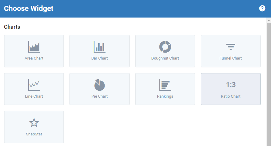
Adding Widgets
The first step to creating your ratios is to click Add Widget – this will allow you select Ratio Chart from the configuration window and begin to set up the select the data that you wish to ratio.
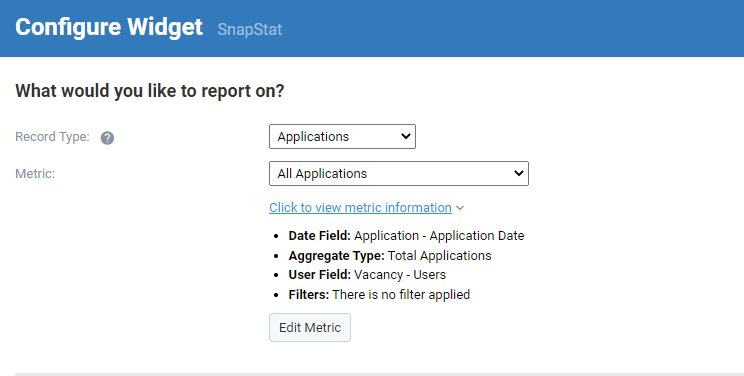
After selecting the Ratio Chart, you will then be able to choose your record type within the widget. The record type is which area of the system you are reporting on – so, are you trying to create a ratio for Applications? Or Vacancies? Or Placements? Choose the appropriate option within the list but don’t worry, you can always change this if you select the wrong option.
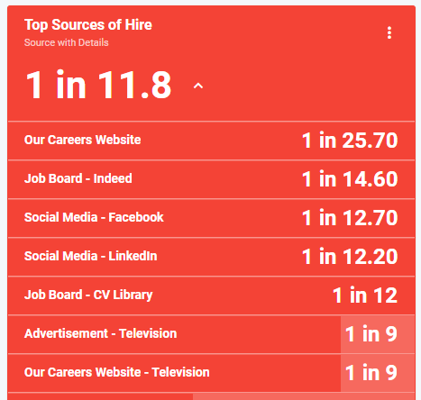
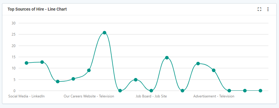
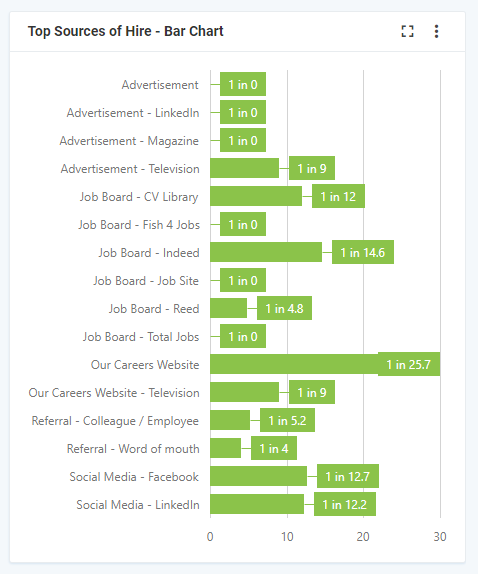
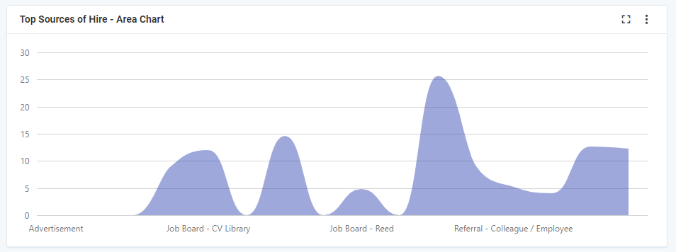
In this example, we are going to create a ratio to show the Top Sources of Hires, helping to highlight not the total number of placements per source, but actually the number of applications required from each source to make a placement. To do this, as we are interested in the number of Applications and NOT the number of placements, the record type to select is Applications.
Top Sources of Hire
Now you have selected Applications as the record type, you can now choose the metric. The metric is the measurement that we are making and will allow us to filter out certain records or focus on records from a particular time frame, business area or source. In this instance, we are interested in all applications, as we need to measure the total number of applications and compare that to the resulting placements.
Note – Using different metrics or measurements will have an impact on your ratios, so experiment using different options to get the best results. There may be certain records that you wish to exclude or focus on, so select a metric that will allow you report accurately. For example, if you are looking for the Top Sources of Hire in a particular business area such as Retail, you will want a metric which filters for all Retail Applications.
From the metric list, choose the metric that will give you access to All Applications and if you aren’t sure which one to choose, remember to Click to View Metric Information to check the details & the filters within the metric.
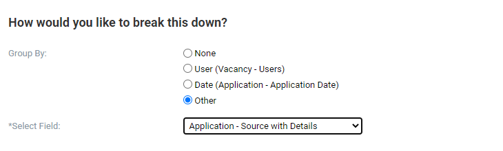
How would you like to break this down?
Now that you have the metric that gives you all applications, you need to break down the chart using the Group By and Ratio By options:
- Group by – This is the detail that you will see within the widget. In this example, we are interested in the source of the applications so we can select Other – Applications – Source with Details from the resulting drop down list. However, there are lots of other options to choose, including based on User relationship (great for creating league tables), Dates (to compare performance over time) or any other associated information within Other.
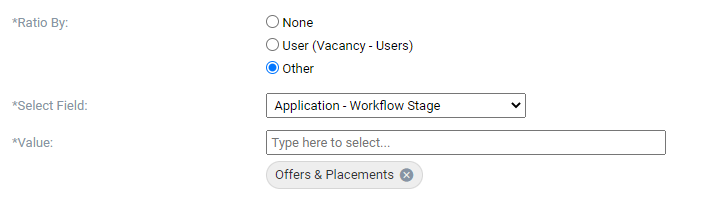
- Ratio By – This is where we choose what we are comparing the records too. In this example, we already know that we have all applications, so to create the ratio for Top Sources of Hire, we need to identify those applications that have become placements. To do this, select Other – Application – Workflow Stage from the resulting drop down list, before choosing the relevant Offer & Placement stages from the Value. There are lots of other options that you can ratio against though, such as User relationships or any other associated information within Other.
Hint – Using the same configuration as above but changing the Group by option will allow you to see the ratio for application to hire across your organisation, split by anything that is recorded within the database. For example, you can show it across different departments or business areas, regions or position types. Try selecting different options within the Group By – Other to get different stats!
Would you like to apply a filter?
Now that you have created the calculation for the ratio, you can use the filter options to look within specific time frames – Year to Date can be particularly useful – or filtering for specific users – My Top Sources of Hire. By changing the filters here, you will get very different results from the ratio, so ensure that you are filtering for the data that you need.
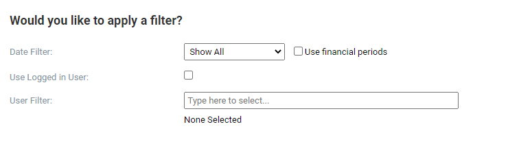
This can be done using the date filter, where you have a series of predefined date ranges, specific dates or rolling date ranges to choose from. The user filter will then filter for any users of the system that you have reporting capability over – leaving either option blank however will include all users and all time.
How would you like to view your widget?
The final section is where you can control how the widget & the information is displayed on the dashboard. This includes the chart types, the colour of the widget and even the decimal places shown in the calculation:
- Title – This is the name of the widget and should clearly describe the information displayed.
- Chart Type – The default option is SnapStat, which allows you to clearly see the headline information. However, you can choose to display your ratio as a line chart, bar chart or even area chart.
- Chart Direction – For those line or bar charts, you can also decide to display the information horizontally or vertically.
- Show Labels – When using the chart options, the labels can help to drive context to the information displayed.
- Colour – When configuring SnapStat ratios, the colours allow you to organise or segregate data – as well as keeping your dashboard bright and engaging!
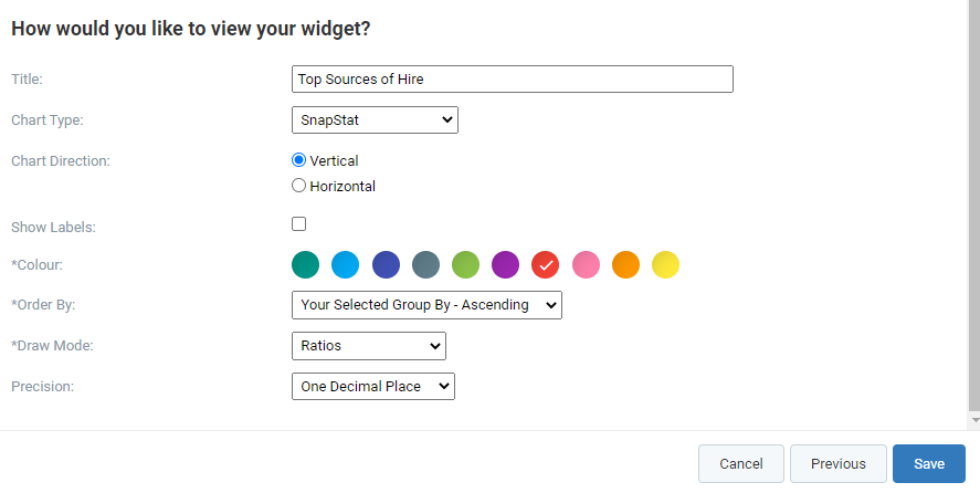
- Order By – This controls how the information is structured within the widget and will allow you to promote high performers in the ratio. Select Ratio Value Ascending to highlight the top performers.
- Draw Mode – You can chose to display the information as a traditional ratio – 1 in 4 – or as a percentage – 25%.
- Precision – This will allow you to go down as far as two decimal places in your calculation, for additional accuracy.
Once you have configured your widget, click Save to view your Ratio!

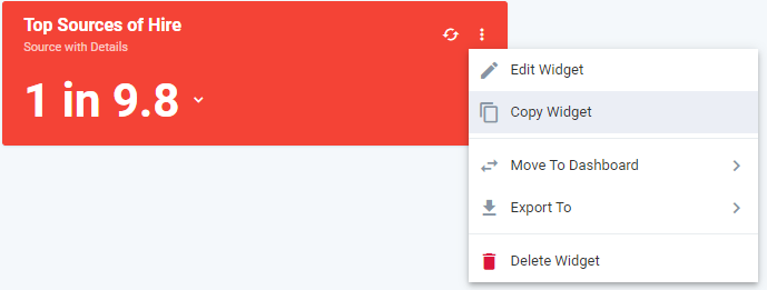
From the widget, you can then use the downward arrow to see the break down between sources, whilst the three dot menu will allow you to edit, copy or even export the data straight into Excel.
Try experimenting with different Group By options & Chart Types to find the ratio that works for you.
Same Metric, Different Chart Types
Using Copy Widget, you can duplicate the ratio you have created and then within Edit Widget, change the chart type to display the same information in a different format.
Comments
0 comments
Article is closed for comments.